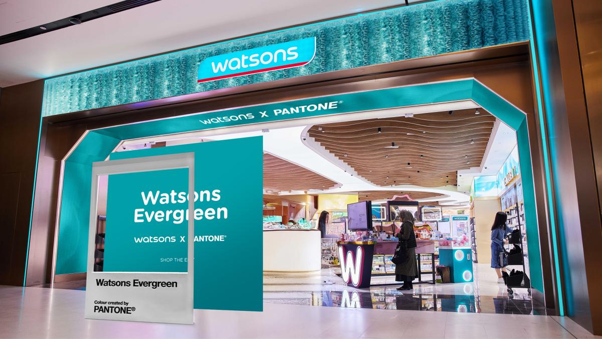
Watsons Taiwan, part of the world’s largest international health and beauty retail group, Watsons Group, today announced the launch of a new brand color, 'Watsons Evergreen,' to commemorate the group’s 185th anniversary. In collaboration with Pantone Color Institute™, the global authority on color, Watsons is establishing a consistent, distinctive, and credible brand image across all global markets. By combining Watsons’ rich brand heritage with Pantone’s expert color knowledge, the two organizations have co-created this global brand initiative to express Watsons’ brand philosophy and future vision.
'Watsons Evergreen' is a vibrant blue-green hue that symbolizes vitality, care, and trust—embodying Watsons’ long-standing commitment to helping customers become healthier and more beautiful. As the most iconic visual element of the brand, 'Watsons Evergreen' will serve as a common brand language across all Watsons-operated markets worldwide, further strengthening the connection between the brand and its customers.
From the Watsons logo and store design to product displays, online platforms, and private-label products, 'Watsons Evergreen' has long been a familiar brand symbol for customers. The 'Watsons Evergreen' initiative will now be rolled out progressively across 16 markets, including regions in Asia, Europe, and the Middle East. Through a series of customer and community events, as well as curated product collections, Watsons aims to reinforce its longstanding relationships with customers and local communities.
The initiative is rooted in a simple belief: Watsons has always grown alongside its customers, and will continue to walk with them into the future. For 185 years, Watsons has supported customers’ health, beauty, and everyday needs through both physical and digital platforms. 'Watsons Evergreen' reflects the deep, enduring bond between the brand and its customers, symbolizing consistent care and companionship in an ever-changing world.
Jared DeGuzman, International Customer Director at Watsons, said: 'For 185 years, Watsons has been dedicated to helping customers live healthier, happier, and more confident lives. Watsons Evergreen expresses this promise in a simple yet powerful way. Through our collaboration with Pantone, we have elevated our iconic brand color into a global symbol of vitality, care, and healthy living—connecting Watsons customers around the world.'
Laurie Pressman, Vice President of Pantone Color Institute™, said: 'Watsons Evergreen perfectly captures the essence of a timeless yet evolving brand. This color not only represents vitality and heritage but also reflects the deep connections Watsons has built with customers and communities over the years.'
As Watsons celebrates this significant milestone, 'Watsons Evergreen' carries forward the brand’s rich historical legacy while symbolizing its future vision. With a unique and distinctive brand language, it connects the past, present, and future, continuing the brand’s promise to grow alongside its customers.
FACT BOX
- Source: PR Times
- Category: キャンペーン
- Organizations: Pantone Color Institute™
- Products / services: Watsons Evergreen